
The Fickle World of Fonts: A Business Owner’s Guide to Fonts
Quick Links
Why Fonts Matter in Branding
Fonts and the overall typography of your brand is one of the most critical elements of your brand’s visual identity. Typography is the style and appearance of written text. The word “font” is often used to describe a particular flavor of typeface in design. When a company is designing a brand identity, a consistent set of fonts should be used to maintain visual familiarity and readability.
The right typography can make your brand feel modern, established, playful, or trustworthy. The wrong font—or one used inconsistently—can quickly make your brand look amateur or outdated.
As branding experts and web designers, we’ve seen firsthand how fonts trip up even the savviest business owners. From licensing confusion to website performance issues to accessibility concerns, there’s a lot to consider when it comes to using fonts correctly across your brand ecosystem.
Fonts convey tone, personality, and professionalism. Just like your color palette and logo, your typography should reflect your brand values, brand archetype and help your audience connect with your message.
Are you a luxury spa? You probably want elegant, minimalist typography. A bold tech startup? You’ll want modern, strong sans-serifs. Fonts play a major role in:
- Creating visual consistency
- Improving readability and trust
- Setting the tone for your brand
- Supporting accessibility and usability
To illustrate this point, in photo below, which restaurant do you think is the most expensive? Which looks like a good place to take kids? The fonts you choose matters in setting expectations!
Our Business Owner’s Guide to Fonts covers everything you need to know, from installing fonts and licensing rules to web typography best practices, accessibility tips, and tools to help you get it right.
What’s the Difference Between Fonts and Typefaces and Typography?
Although the terms are often used interchangeably, “fonts” and “typeface” and “typography” refer to different (but related) concepts:
Typeface is the overall design or style of the letterforms. It’s the artistic family or look. For example, Heletica.
Font refers to a specific style and weight within a typeface family—such as Arial Bold 12pt. It’s the file you install and apply. For example, Helvetica Bold 12pt
Typography is the broader art and science of arranging text. It includes choosing the right fonts, deciding on line spacing (leading), letter spacing (tracking), and how text is aligned and displayed across different mediums.
In short, fonts and typefaces are tools. Typography is how you use them. Great typography ensures that your text is readable, aesthetically pleasing, and aligned with your brand tone and values.
Cool fun fact! In traditional printing, fonts were individual metal pieces — each size and style had its own set. Today, in digital design, the difference is more conceptual, but still useful when talking about branding or choosing typography for web or print design.
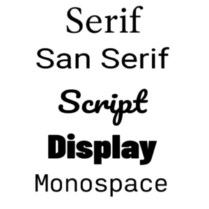
5 Types of Fonts: A Quick Overview
Understanding types of font can help you choose the right style for your brand’s tone and message, and can help you communicate with your graphic designer. Here are the main categories:
- Serif: These fonts have small lines or “feet” at the ends of letters (e.g., Times New Roman, Georgia). They often feel traditional, professional, or academic. A lot of books and newspapers use serif fonts.
- Sans Serif: “Sans” means without, so these fonts have clean lines with no decorative edges (e.g., Arial, Helvetica, Open Sans). They’re modern, readable, and often used in digital applications.
- Script: Also known as cursive, these are designed to mimic handwriting or calligraphy (e.g., Pacifico, Lobster). These are best used sparingly due to readability concerns.
- Display / Decorative: Bold, artistic fonts meant for headlines or logos (e.g., Impact, Bebas Neue, Comic Sans). Great for attention-grabbing uses but not for body text.
- Monospace: All characters take up the same width (e.g., Courier New). Typically used in code or stylized branding to make it look like a typewriter.
Each category carries a different feel—so choose intentionally based on your brand’s personality and your communication goals.

Looking for more useful categories of fonts? Check out our Google Font Finder tool.
How Do You Know What Fonts Are Used in Your Logo?
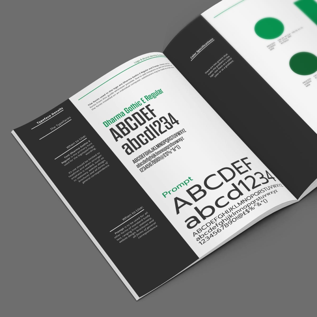
Fonts in Brand Guidelines
If you had a professional logo designer or creative agency create your logo, you may have also received brand guidelines (also called a brand kit or brand book). Your brand guidelines are the source of truth for how your visual identity should be applied—and fonts typically get a dedicated section, which may include:
- Primary and secondary fonts: Include font names, styles (regular, bold, italic), and usage examples.
- Use cases: Define where each font should be used (e.g., headlines, body copy, calls to action).
- Web vs. print variations: Note if there are alternate web-safe versions or fallback fonts.
Typically a logo will have anywhere from 1-3 fonts. Fonts that are more ornate or stylized are reserved for headlines or “display type.” Whereas the body copy font should be more plain with a focus on legibility.
Clear typography rules help internal teams and outside vendors alike maintain consistency in presentations, printed materials, social media, and your website.
How to Identify Fonts in Logos or Designs
What if you don’t have brand guidelines or aren’t in touch with your logo designer? How do you know what font was used in your logo or what you should use?
If you’re trying to figure out what font was used in a logo — or any graphic — try a font recognition tool:
These tools let you upload an image and visually match it to known fonts. If the font is highly stylized, it can usually get a correct match. If it’s something more standard, it will show a lot of options that look similar. These tools are a great place to find backup / fallback fonts, which we’ll cover later.
If you’re looking for font inspiration, check out Fonts in Use!
This collection oftypography showcases fonts on various marketing materials and designs so you can how see different fonts and font pairings may look in real life.
Font Copyrighting, Licensing & Sharing: What’s Legal?
If your designer has used a specific font in your logo, they may have shared it with you in a zip folder.
But due to font licensing restrictions, it’s not always legal to copy a font file and send it to your whole team. Most professional fonts come with licenses that dictate how they can be used:
- Desktop license: Allows installation on a specific number of devices.
- Web license: Required for embedding on websites.
- Ebook or App license: Separate license for use in apps or digital publications.
Many popular fonts require a separate license for web or email use—even if you’ve already bought a desktop license.
Are fonts copyrighted or trademarked?
In the U.S., the appearance of a font itself is not protected by copyright. However, the computer software code that makes up a font, which is how a typeface is rendered by a computer, is protected by copyright.
Typefaces and their letter forms are considered utilitarian objects whose public utility outweighs any private interest in protecting their creative elements under US law, but the computer program that is used to display a typeface, a font file[a] of computer instructions in a domain-specific programming language may be protectable by copyright. In 1992, the US Copyright Office determined that digital outline fonts had elements that could be protected as software[13] if the source code of the font file “contains a sufficient amount of original authorship”
That is not to be confused with trademarking a logo that uses a specific font, which is able to be trademarked.
Always check the license before sharing or using a font in a new medium, and talk to an attorney if you are interested in trademarking your logo.
Web Fonts vs. Custom Fonts: What’s the Difference?
Another tricky factor about fonts is that not all fonts can be used on websites. Custom fonts must be specifically licensed for web use and embedded using CSS. That can lead to complications.
Pros of Custom Web Fonts:
- Unique, brand-specific look
- Complete control over brand consistency
Cons of Custom Web Fonts:
- Can significantly impact page load speed, especially if multiple font weights or styles are used
- Must be hosted correctly and licensed for web
- May not render the same across all browsers
Due to all these complications, it’s common for web designers to pick a fallback font(s) that is a web-safe font (for example, anything from Google Fonts) if they don’t have the appropriate license and/or are concerned about website performance.
Best Practice:
- Don’t use more than two fonts (e.g., headline and body) on your website. Keep it lean for speed and accessibility.
- For the best accessibility (and SEO) don’t embed images with words in them on your website. The primary exceptions to this would be for logos or really complex infographics.
Using Custom Fonts in Email
Emails are even trickier than websites when it comes to fonts. Most email clients (like Outlook or Gmail) don’t support custom fonts, which is why email marketing softwares like Mailchimp, Constant Contact and MailerLite don’t have very many options (and likely don’t support your brand font).
Best Practices:
- Stick with the most common web-safe fonts: Arial, Georgia, Verdana, Times New Roman, etc. for email for the least amount of rendering problems.
- If you must use a brand font in email, create a graphic (e.g., your logo or an email newsletter header graphic) and embed it.
Using Custom Fonts in PowerPoints or Presentations
Branding your PowerPoint, slide deck or presentation with your colors and fonts is another way to make your presentation stand out and to help your brand be recognized by the audience.
Warning: If you use a non-common font and email the slide deck to someone, if that font is not installed on their computer, a replacement font will be used, which possibly messes up the whole deck. Headlines sizes and text wrapping can change, causing all sorts of a mess.
Even bigger warning: The same goes for if you have your presentation on a flash drive and use someone else’s computer to present, your font could be replaced with something installed on that computer. Yikes! You absolutely don’t want this to happen right before you talk to the board of directors or a group of potential clients!
Best Practices:
- Stick with the most common web-safe fonts: Arial, Georgia, Verdana, Times New Roman, etc. for email for the least amount of rendering problems.
- If you must use a brand font in email, create a graphic (e.g., your logo or an email newsletter header graphic) and embed it.
- If you already have a PowerPoint or presentation with custom fonts, save it as a PDF when you need to email it to someone or present it on a computer other than your own. This will prevent issues with the formatting!
Watch Out for Script Fonts: Pretty But Problematic
In this example, the script / cursive font used is nearly impossible to read! Not recommended, no matter how cool it looks!
Cursive or script fonts can feel upscale or feminine — but they’re often a poor choice for headlines or body copy.
Why?
- Harder to read, especially at small sizes
- Not accessible for users with dyslexia or vision impairments
- Low contrast and overly decorative designs reduce legibility
Use them sparingly, if at all. Never use script fonts for long paragraphs or important navigation items. Keep in mind, some script fonts are easier to read than others.
In this example, the main text uses a readable serif font. They keep the cursive font to the initials, which adds a nice design element without being difficult to read.
Keep in mind the more stylized your fonts — even if they aren’t cursive — the trickier it can be to actually use them in the real world. Plus the more trendy the font seems right now, the more outdated it could look in 10 years.
This is why most large corporations tend to play it safe and choose more ordinary fonts for their logos in order to have a more timeless brand and ease of use across dozens of channels and hundreds of different software.
Font Accessibility & ADA Compliance
Making typography accessible is absolutely the right thing to do. Fonts that are hard to read can alienate users with vision challenges or learning disabilities.
The problem is that optimizing for legibility and readability isn’t always the top priority of font foundries and typography experts. In fact, most available fonts do not meet the accessibility standards set by the ADA.
Best Practices for Better Accessibility:
- Use sans-serif fonts for body copy
- Ensure high contrast between text and background
- Avoid overly narrow, condensed, or decorative fonts
Which fonts are easiest to read (ADA-friendly)?:
This is a short list of fonts that are easy to read for people with dyslexia, vision challenges or other learning disabilities.
- Atkinson Hyperlegible
- Lexend
- Open Sans
- Roboto
- Arial
- Verdana
- Tahoma
How to Download and Use Fonts
Installing Fonts on Your Computer
Programs like Microsoft Word, PowerPoint, and Adobe Illustrator don’t automatically load custom fonts from the cloud. To use your brand fonts, you must install them locally on your computer.
How to Install Fonts on a Mac
- Download the font file (.otf or .ttf). (Note: You may need to unzip the file first)
- Double-click the file.
- Click “Install Font.”
- Your font will appear in Font Book and be available in most apps.
How to Install Fonts on Windows
- Right-click the downloaded font file (.otf or .ttf). (Note: You may need to unzip the file first)
- Click “Install”
- Restart your application if the font doesn’t appear right away.
Once you’ve installed a font, you should be able to choose it from any desktop application list of fonts. Note: this does not apply to web-based applications such as social media or Canva accounts.
Read this article to learn more about uploading custom fonts to Canva.
How to Download and Use Google Fonts
Google Fonts is a great free resource for open-source fonts that work across web and desktop, which is why Google Fonts are so popular, especially for web design companies.
How to Use Them on Your Computer:
- Visit fonts.google.com
- Choose your font and click “Download Family”
- Install the fonts as you would any other (see above)
Try Our Google Font Finder Tool
Looking for the perfect Google Font combo? Check out Bizzy Bizzy’s custom Google Font Finder Tool!
This isn’t a visual font matcher—it’s even better. You can type in your own headlines or copy and preview them across curated font pairings, hand-curated and categorized by style. It’s ideal for exploring combinations that work well for websites and branding.
5 Great Places to Buy Affordable Fonts
Looking to expand your brand font library? Check these out:
- Creative Market – Our favorite place to get cool fonts! Tons of indie designer fonts at reasonable prices.
- Adobe Fonts (Typekit) – Included with Creative Cloud; great for web and desktop.
- MyFonts – Huge collection, great for premium typefaces.
- Fontspring – Font licensing made easy and clear.
- TheHungryJPEG – Affordable bundles and occasional free fonts.
If you find your brand font or another cool font on a website for purchase or free download, use your due diligence about whether the source looks trustworthy! According to one online source, a font could include a virus or other harmful code. Be careful what you download, especially for free!
Final Thoughts: Fonts Are a Branding Power Tool
The typography choices you make can elevate your brand—or undermine it. With the right strategy and resources, you can use fonts beautifully and consistently across print, digital, web, and more.
If you’re struggling to make your fonts work across platforms—or just want to get more strategic about your brand identity—let’s talk.
Bonus Font Jokes:
The SNL Avatar Font Skit: Why Designers Cringe at Papyrus
In a hilarious SNL sketch, Ryan Gosling plays a man haunted by one simple fact: the Avatar movie logo uses Papyrus—a free, seriously overused, and highly stylized font that comes preinstalled on most computers.
The sketch perfectly captures how graphic designers feel when a major, high-budget production defaults to a font that’s… well, widely considered tacky. The absurdity lies in the missed opportunity to create something iconic—and instead using a font better suited for a yoga studio logo circa 2005.
The takeaway? Font choices matter. They send a message, whether you mean to or not.

