The Complexity of Color
Children learn to distinguish and identify their colors as early as age 2, so you may be asking yourself “Why can’t my graphic designer get the color right on my logo?”
Color is a big topic in graphic design, often one that causes confusion and frustration for customers, who understandably think it should be simple. You want a green apple in your logo. So make it look like apple green. Unfortunately, it’s not that easy…
If you total it up, I have probably spent a few solid days of my life trying to explain color concepts to clients and attempting to explain why they are seeing something different than what will output at the printer. It’s a complex issue with many variables. Even if you never really understand why, you may need to resign yourself to the fact that you can’t trust your computer monitors or your office printer for color matching. Here’s why…
CMYK vs. RGB Color Mode
Whether you are printing on your home inkjet or laser printer, or whether you are talking about sending your work to a commercial printer, your graphics or marketing materials are likely going to be created using “CMYK process printing” or “four-color printing.” There are other types of printing (some with better color matching), but those options are usually cost prohibitive for small businesses. Four-color digital printing is probably what 95% of you are using for your business cards, flyers, brochures, etc.
Regarding color reproduction, four-color printed artwork is separated into four subtractive printing colors (cyan, magenta, yellow, and black, or CMYK). The “K” in CMYK stands for key because in four-color printing, cyan, magenta, and yellow printing plates are carefully keyed, or aligned, with the key of the black key plate. These four inks combined produce the illusion of a full range of colors on the printed page, but ultimately the typical magazine or brochure image is composed of only four colors.

This is the same website shown on two different monitors. You can see that the color varies a lot between the two. And neither of these colors accurately represent what the blue/green on The Artery business cards looks like.
By comparison, modern computer monitors can display millions of colors, producing a richness of color that is better than even the best quality color printing. Finally, computer displays show color images using the additive RGB (red, green, blue) color system, which can display a much broader and subtler range of colors than conventional four-color printing. This can also be described as transilluminated display — the colored light shines out from the screen. Transilluminated images deliver a much greater range of contrast and color intensity than images printed on opaque paper, which depend on reflected light.
The artwork, as it appears on your computer screen, is almost certainly not an accurate view of how it will look in print. Here’s just a few of the reasons why:
- Every computer screen or device renders color differently.
- On-screen proof is using a totally different method of creating color than a printed piece, and some on-screen colors are actually impossible to reproduce in four-color printing.
- Even different programs on the same computer can render color differently.
The artwork as it appears after you print it on your home or office printer is probably more accurate than your computer monitor, but still not that accurate. Here’s why:
- Inexpensive home printers are not accurately calibrated for color and may vary wildly.
- The paper you are using is likely different than commercial paper your piece will be printed on and may have different reflective qualities.
- You may notice a major shift in colors as your ink cartridges or toners cartridges age.
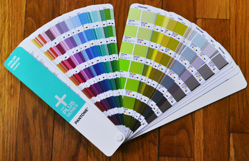
Spot Colors and the PANTONE Matching System
If the color of your logo is critical, there is one option that exists for the most accurate color matching possible, spot color. A spot color is a premixed ink that is used instead of, or in addition to, CMYK process inks. The industry standard for spot color printing leverages the PANTONE Matching System (PMS).
The Pantone Color Bridge shows PMS spot colors on the left and their closest CMYK process color match on the right. Some colors are more closely matched than others. Note the neon green on the left and the more muted green on the right. Neons can’t be replicated in conventional CMYK process printing.
PMS colors are composed from nine basic colors, including white. From the specific combination of these nine colors, PMS can produce over 700 exact colors. This system is often used in creating business cards and letterheads. Unfortunately, because the inks are premixed and used on only one job at a time, this printing is too expensive for most small businesses.
As you can see, the main difference in on-screen colors as opposed to CMYK printed ink and PANTONE printed ink colors occurs because all three systems described above initially combine different colors that make different tones. Most printers will tell you that without using Pantone SPOT color inks an exact color match is not possible, and most commercial printers have a “color disclaimer” that basically says they are not responsible for color matching.
What Can You Do To Get The Closest Match Possible?
Other than using expensive Pantone inks, the best thing to do is just to look at a PANTONE swatch book when you are picking out the colors for your logo. Most graphic designers should have a Pantone Color Bridge, which shows the fancy Pantone ink colors right beside their closest match in the CMYK digital printing spectrum. There are a limited number of Pantone colors that can be matched in the CMYK digital printing process, and some match more closely than others. Even if you don’t ever print with PANTONE inks, looking at a PANTONE swatch book will tell you what you can expect in terms of on-screen vs. print color matching. Note that this must be done in person. You can not look at the PANTONE website to choose your colors (see previously why on-screen color is not accurate).
If you are working remotely from your printer or designer, you can mail them something that shows the color you want: either a print out or a piece of ribbon or a paint swatch from your hardware store to show them the color you want. In some cases (especially with neon colors or very intense hues), a CMYK match might not be possible. But at least your printer or graphic designer will know the color you are looking for and they can match it as close as possible.
Once you have picked a Pantone color and the designer has incorporated it into your logo or other artwork, realize for all the reasons mentioned above that the color on your monitor and/or home printer may not look like the color you picked out. But if your designer did their job correctly and if you are using a good printer, the end result will be a printed piece with the closest color match possible for CMYK digital printing.
On the other hand, if the way your logo looks in print is less important than the way your logo looks on screen (for example, on websites, apps or social media), then pick the RGB side of the Pantone Color Bridge that looks closest to the color you want. Just know that for certain colors, your printed version of your logo may not look the same.