
From Cringe to Yikes to Oops! A Look at Trump Campaign’s Scary Graphics
Donald Trump is a billionaire who is running for president. You wouldn’t deduce that by looking at his campaign’s graphic design. Some of it is fine, but some of it is pretty scary. Few people are going to choose their leader strictly because of their graphic design choices (and we don’t recommend that), but taking a look at the mistakes his campaign is making can shed light on the importance of hiring professionals and investing in your marketing.
Cringe: Trump Pence Logo and Branding Disasters
You’ve probably already heard about the infamous logo design gaffe of the original Trump / Pence campaign logo.
The original Trump – Pence campaign logo
The interlocking “T” and “P” were lambasted on social media for their awkward depiction of…well, you get it.
![]()
Shortly after all the unintended “T-in-the-P” logo notoriety, the Trump campaign released a modified version of its logo.
New Trump – Pence campaign logo
This one hasn’t gotten a lot of attention, but for designers, this is still a bit visually unsettling, specifically the alignment (or lack thereof) of the Pence letters. The natural tendency would be to center each letter below the correlating Trump letter. After all, there are 5 letters in “Trump” and 5 letters in “Pence.” Why wouldn’t you make that easy choice? But instead notice how the “P,” “E” and “N” are right-aligned with the letters above them but the “C” is centered and the “E” is left-aligned. Hmmm.
Trump isn’t even using the official logo on the Twitter page, which is a huge branding no-no. Your official logo should be on everything you create. Also, this is pretty amateur Photoshopping work. Notice the dark shadow around the edge of their entire bodies. If they were really standing in front of a big flag backdrop or monitor, there is almost no real lighting scenario when this would happen.
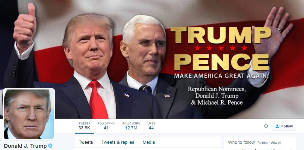
This is Trump’s Twitter header, not using the official logo. That’s just plain ol’ bad branding!
Yikes! Trumps Bad Graphic Design
We found dozens of graphics on Trump’s Twitter page that looked like Trump himself might have thrown them together in PowerPoint while drinking a beer at Chili’s in the Toledo airport.
These graphics are breaking so many of the cardinal rules of branding and design it is painful. Rules such as using consistent fonts and colors, white space, legibility, alignment, contrast and hierarchy are largely being ignored. Amateur is a polite way to describe these.
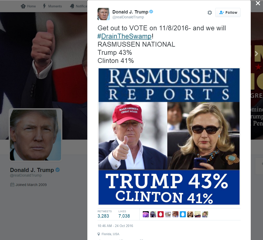
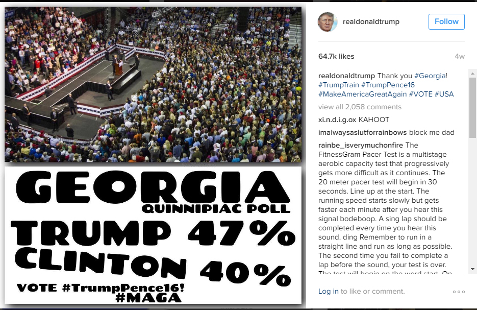
The examples below show almost no whitespace. The letters are crammed right up to the edge of the graphic for that “accidentally cropped” look. They didn’t even bother to match the two colors of blue within this one graphic, and it may be hard to see at this size, but the “Rasmussen” logo is low resolution and pixelated. The Trump campaign has been calling Hillary “crooked” this whole campaign, which we assume is why the “Clinton” line is not aligned appropriately. However, that’s an inside joke, and to the rest of us, it just looks like an old newspaper paste-up mistake.
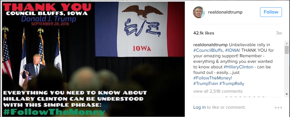
This font, really?? Nothing says serious politician like a big, bubbly lemonade stand font.
We’re not sure if this graphic was actually from the Trump campaign, but it was on their Twitter feed and just too bizarre to pass up. Check out that floating head!
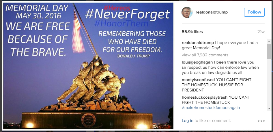
And this graphic features yet another font, (just because you are referencing a historical moment doesn’t mean you can’t also show off your sleek and high tech side) and Trump’s beloved abuse of the CAPS LOCK key. Also note the illegible hashtags, one of which is misspelled (#hereos). To be fair, it’s hard to catch errors when you can barely see the words!
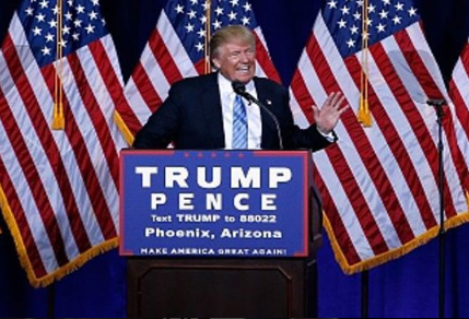
The words here are practically running off the edge of the sign. Apparently no one on the design team knows how to set up a banner for print with the appropriate margins and bleeds. And notice the Trump / Pence logo letters now have a totally different alignment and spacing than the official logo. They are seriously overdue for some brand identity guidelines!
Oops! Trump’s Website Needs UX and QA Help
We checked out the official Trump website. Overall, this looks a heckuva lot better than most of his social and print graphics. However, it appears their Quality Assurance person is on vacation (or doesn’t exist.) The mobile site is still showing a banner (actually a cool design here) that is over three weeks old from the Vice Presidential debate on Oct. 4.
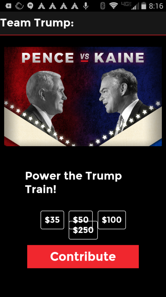
No one bothered checking the site for cross device compatibility: notice those donation buttons overlapping. Apple’s iPhone Human Interface Guidelines recommends a minimum finger target size of 44 pixels wide 44 pixels tall for any type of touch target (button or link). These buttons would be difficult to touch for people with even average-sized hands. Maybe they are hoping people will accidentally donate $250 when they intended to donate $50.
Further down on the site, when you click on “Continue to Website” it doesn’t go anywhere. You are just stuck on that page. In fact, the only way to get off that page is to contribute. What a frustrating user experience!
4 Lessons Learned from Trump’s Bad Graphic Design
There are a few important lessons we can take away from the Trump campaign’s mistakes in design and branding.
1. Branding is key for building trust and recognition.
If you can’t tell that the Twitter page is official because it has a different logo than the website, you will lose real followers. Use the same logo on all your marketing!
2. Design is essential for readability, comprehension and aesthetics.
If people can’t actually read a graphic or sign, well, that’s just kind of pointless. If your advertisements and marketing materials aren’t professional looking, people will wonder what else you might be skimping on.
3. User experience is important.
If you promise something (click here to go there) and you don’t deliver, people will stop clicking. If people are frustrated using your website for any reason, they will leave…without contributing to your campaign.
4. Quality Assurance is vital.
When you have outdated material on your website and spelling errors, at the very least, you look silly. At the worst, people stop considering you a credible source…for anything.
Skimping on hiring professionals to create your brand, website and marketing materials will hurt you in the long run. We doubt terrible design will be swaying any elections any time soon, but it certainly isn’t helping the Trump campaign.
Have you seen bad graphics from people or companies who should know better? Send us a comment!

