Top 5 Website Mistakes Made by DIY Website Builders
Quick Links
Audio Overview generated by Notebook LM
We all know someone — a nephew, a sister, a cousin, a spouse, or a neighbor — who has built a website before. Or maybe you’ve been hearing YouTube ads about building a professional website for free on your own.
So why would anyone want to hire a professional web design company and spend thousands of dollars when they could get a cheap website from someone they know or build a free website themselves?
Well for starters, website design is actually more complex than those ads make it seem. If you hire someone who is inexperienced to build your website, you could miss out on major opportunities — or worse — seriously hurt your startup in the long run.
There are dozens of factors, including your branding and messaging, the design and the technical code “under the hood” that will make or break the success of your website.
So read this first to avoid the top mistakes with DIY websites to make sure your website takes you where you want to go.
Note: If your nephew is a highly experienced professional web designer who makes a living building websites for clients, then you’re probably in good hands!
#1 Mistake: Missing SEO Opportunities
The number one mistake — and the most critical in terms of your startup success — is missing opportunities to optimize your website for search engines like Google.
Search Engine Optimization (SEO) is complex and multi-faceted. Many parts of the website contribute to SEO, and more often than not, DIYers don’t even consider SEO when building a website.
The process of optimizing your site for Google includes:
- technical SEO;
- content-based SEO;
- and ongoing work such as blogging and driving traffic to the website.

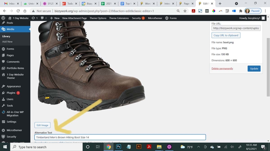
Adding “alternative tags” is an easy SEO and accessibility feature in most website platforms that almost no one remembers to do!
Some of the technical SEO will be beyond the capabilities of most DIYers, but much of the content-based SEO can be done by anyone with a little training.
It’s no secret that “Googling” is how the vast majority of consumers find information and discover products and services to buy. In fact, experts estimate that between 40–60 billion searches happen on Google.com each month in the U.S. alone.
If you’re not optimizing your website for Google, you could be missing out on dozens, hundreds or even thousands of visits to your website each month.
Quick Tips for Better SEO
A couple quick tips for “low-hanging SEO fruit”:
- Don’t forget to add the “alternate tags” on every image you upload.
- Make sure you are using exactly one H1 tag on each page, including on your home page.
- Use the most important keyword phrases in the website text, including your business name!
Avoid the most common SEO mistakes by using the resources below.
Go Deeper!
- Read more about common SEO mistakes.
- Watch our video about keyword research.
- Download our WordPress blog SEO checklist.
#2 Mistake: Not Using Design Best Practices
Let’s face it, not everyone has a great design eye. And while some aspects of design are subjective, many elements of design follow standards or rules.
Some of the biggest design offenders we see on DIY websites are:
- cramming too much information for the space;
- not using enough visual elements;
- not using size contrast / hierarchy;
- having unreadable font or otherwise illegible text;
- generally off brand design.

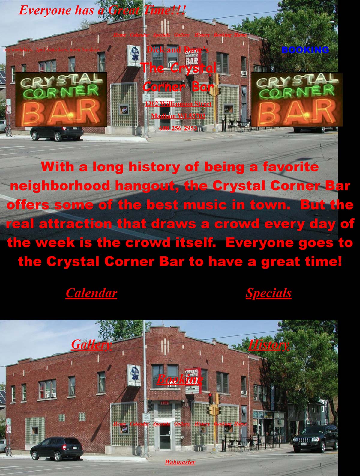
This website is breaking many design standards, it is difficult to read with low contrast font colors, has unexpected navigation location and uses hierarchy poorly.
Research shows, good design builds trust with website users. According to one study, when survey respondents distrusted a website, 94% of them reported that this mistrust was directly related to the site’s design elements. Only 6% said their distrust was based on the actual content of the site.
So you can see how important good design is for your startup website.
Quick Tips for Better Design
- Use more whitespace than you think you need.
- Use your brand guidelines or a color picker tool like this to exactly match the color formulas / hex codes from your logo.
- Use no more than 2 fonts on your website, and make sure they are easy to read!
Go Deeper!
- Read 10 Essential Visual Design Best Practices for Beginners article.
- Watch this video on Web Design Best Practices.
- Browse stats about Web Design Standards.
#3 Mistake: Not Optimizing Your Images
Another common mistake on DIY websites is poorly optimized images. This often comes in the form of:
- stretched or poorly-sized images;
- non-mobile friendly images;
- and slow-loading images.
We know having large images adds to the user experience, but huge, slow-loading images will cause users to leave before the page even loads.

Keep in mind, the larger the image is, the slower it will be to load, especially on mobile devices. But on the other hand, if you use images that are too small, they could be pixelated on larger screens. Also poorly sized images have that stretched look, which makes the site look unprofessional.
A good rule of thumb is to resize images before you upload them to the approximate pixel dimensions where your image will appear on the website using photo editing software. Typically if an image is going to be used for a blog, you won’t need anything larger than 1200px wide. If you are using an image as a full screen visual, you might want it to be 1920px wide.
Quick Tips for Better Optimized Images
- Scale images vertically and horizontally with a one-to-one ratio to avoid the stretched look.
- Use the .PNG file type only if you need a transparent background such as for a logo or an overlay on a colored background. (PNG files types can be up to 4 times larger than their .JPG counterparts.)
- Leverage caching and CDN to increase your page speed.
- Keep all images on your website under 300KB in size.
Go Deeper!
- Read What is Caching?
- Watch this video on Batch Image Editing and Uploading in WordPress
- Try a tool like Adobe’s Express Image Resizer to practice optimizing your images.
#4 Mistake: Off-Target and Off-Brand Messaging
Messaging is a success factor for all the major big-name brands, but unfortunately, it’s something startups often overlook. Many startups websites focus too much of the copy on themselves and how great their products are and not enough on the benefits of their customer.
Part of the problem is that startup founders spend so much of their time neck deep in product specs and features, it can be difficult to get out of their heads and into the mind of someone who knows nothing about their products or services.
And the other problem is that startup founders often don’t have a solid understanding of branding and what makes a magnetic brand, and they find it difficult to clearly articulate how they are different or better.
Quick Tips for Better Messaging
- Talk directly to the consumer using “you” instead of “our customers.”
- Speak to the customer’s pain points.
- Don’t forget to clearly say what you are selling!
- Let past customers do the talking for you in the way of testimonials or case studies.
Go Deeper!
- Read 5 Elements of a Successful Brand Messaging Strategy
- Watch the video Writing Copy That Converts.
- Try our Interactive Brand Voice Tool.
#5 Mistake: Using Too Much Content without Formatting
We hear it over and over again: “I don’t like websites with too many words.”
Most people who land on your website and see a huge wall of text will feel instantly overwhelmed. But that doesn’t actually mean you should avoid using a lot of text on your website. In fact, users who are truly interested in your products or services will, in fact, read a lot of content. But the catch is that it can’t look like it’s a lot to read. And first, it has to be scannable so the user can tell if they are interested in reading more.
In one study, 79% of test users always scanned any new page they came across versus reading every word.
By using columns, images, icons, buttons, and other design elements, you can make a lot of text look easy to read. In addition, formatting text and breaking it up with enticing titles, subheadlines, bullet lists, and short paragraphs will improve the scanability.

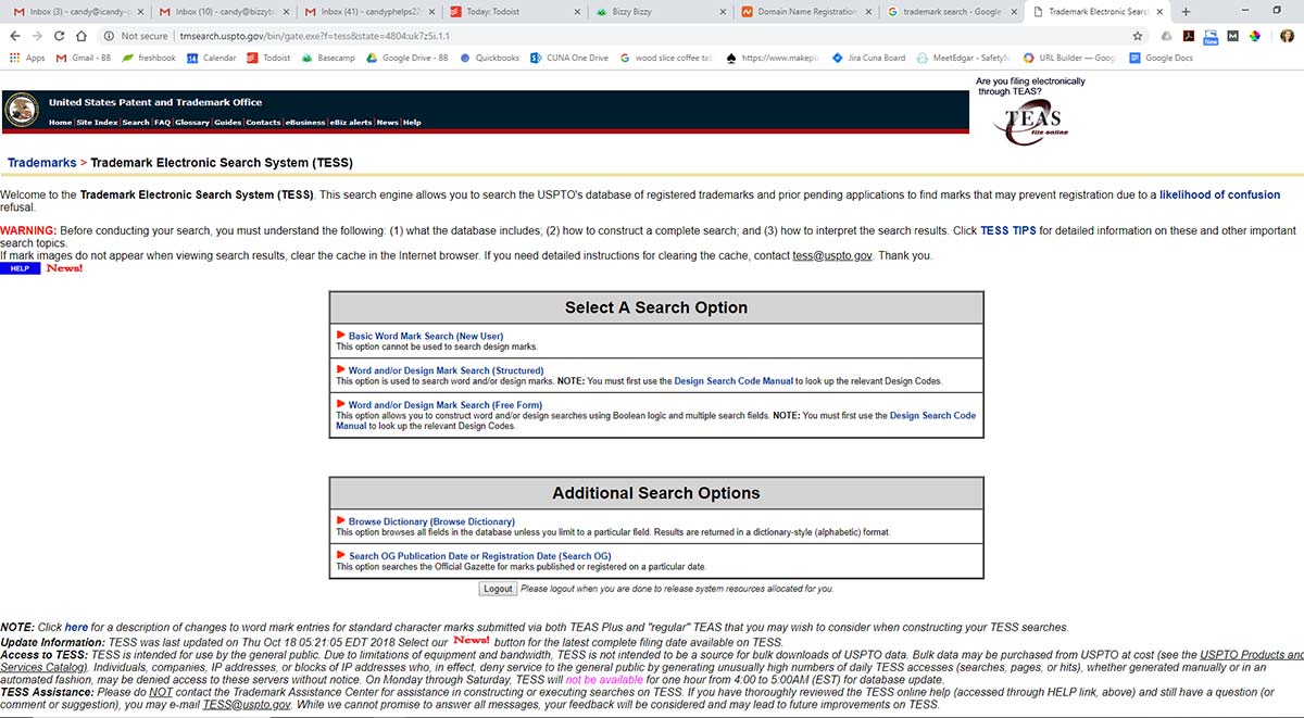
With few visual elements, long lines of text and very little typographical hierarchy, this website page looks like a real burden to read.
Quick Tips for Better Formatting and Layout
- Apply the 5-second test. If visitors can tell exactly what your page is about in 5 seconds, you’ve done a good job.
- Avoid using long lines of text that span the full width of the page.
- Convert lists into bulleted or numbered list, or even side-by-side columns with a visual for each.
Go Deeper!
- Read How People Read Online: New and Old Findings
- Watch the video How to Format Text on WordPress Post
- Read How to Make Your Website More Scannable
Conclusion
These are just a few of the most common mistakes we see DIY web designers make. As you can see, creating a website may not be as simple as it seems! Professional website design firms have training, experience and knowledge that truly can affect the success of your startup.
So before hiring your nephew or DIYing your website, consider whether you have the time to learn everything you need to know to make your website a valuable asset to your business.


